Obama “mad” message testing
Available statistics/information
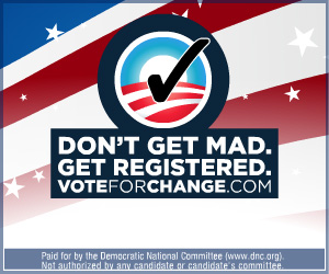
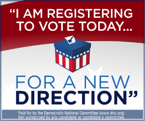
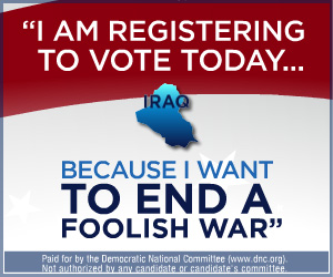
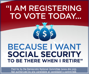
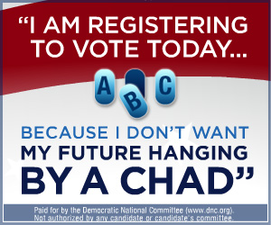
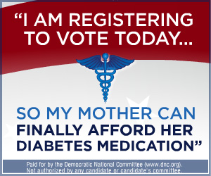
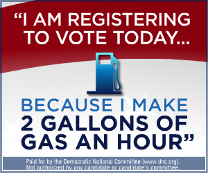
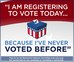
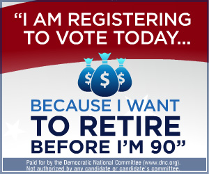
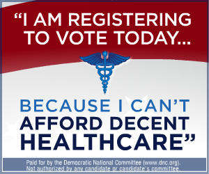
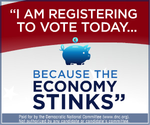
There were 10 different versions of this Obama banner design. Each quote used in the banner was taken verbatim from focus groups questioned by the campaign. The goal of the ad was to secure information about hot topics and learn how they motivate people to register to vote.
Generally banners are used to get people to do something on a website–the genius of this banner was that it was made for the sole purpose of collecting reactions.
The banners touched on, health care, the Iraq war, gas prices, the economy, social security, and political process.
Play
A pretty low-key button rollover was used at the end this banner.
Notes
This banner was more focused on the issues than on Barack. This was the only Obama-free banner that I made. This banner drags you right in with fast movement, strong copy, and funky red, white, and blue graphics.
The final logo in the ad was provided by the Obama design team.
The thing I loved about the entire campaign was that they never seemed to push for fear-based issues. Americans are pissed. It’s about time someone started taking care of things.
Date completed
August 25th, 2008
Messaging
• I am registering to vote today
• Because… [see static images to the left]
• Don’t get mad, get registered. VoteForChange.com
• Register Now
Size
300×250


